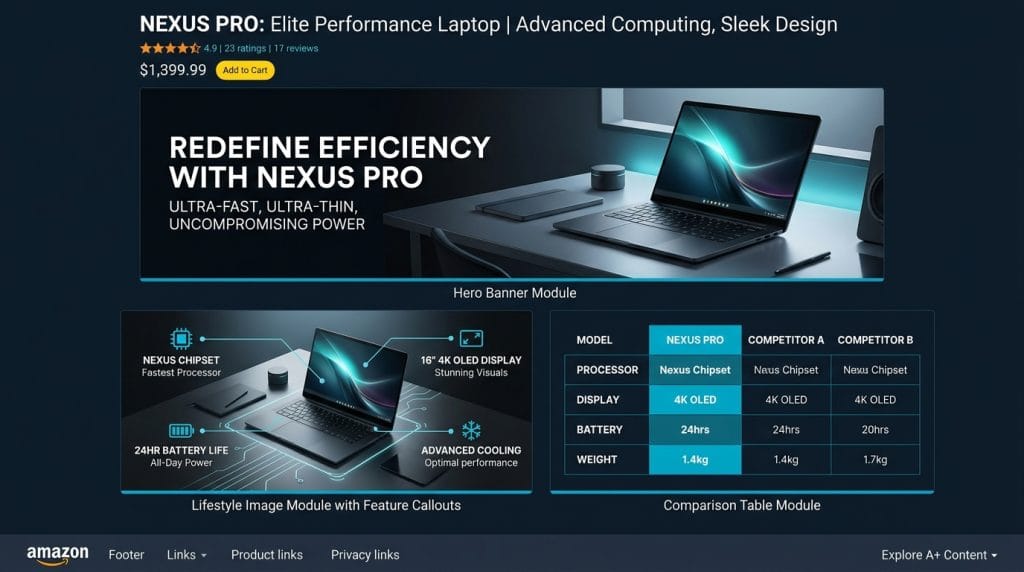
TL;DR: Amazon A+ Content can lift conversion rates by 3 to 10% for standard modules and up to 12% for Premium A+ (Brand Story). The modules that drive the most conversions are comparison charts, lifestyle imagery with hotspots, and above-the-fold hero images. The biggest mistakes sellers make: text-heavy layouts, ignoring mobile, and skipping the comparison table. Here’s exactly what to do instead.
Amazon A+ Content: What Actually Increases Conversions
You’ve done the hard part, you’re driving traffic to your Amazon listing. But if your product detail page is converting at 10% when it should be at 18%, you’re leaving a significant portion of revenue on the table every single day.
Amazon A+ Content is one of the most powerful conversion tools available to brand-registered sellers, and one of the most misused. Done well, A+ modules can increase your conversion rate by 3 to 10% according to Amazon’s own data. Done poorly, they add visual clutter that actively hurts sales.
This guide covers exactly which A+ modules increase conversions, what the data shows, real-world examples of effective layouts, and the pitfalls to avoid. Whether you’re building A+ Content for the first time or auditing an underperforming listing, this is your practical playbook.
This article is for brand-registered Amazon sellers, marketing managers, and agencies looking to maximize listing conversion rates through better creative content.
What Is Amazon A+ Content?
Amazon A+ Content (formerly Enhanced Brand Content for third-party sellers) is a feature available to brand-registered sellers that allows them to replace the standard product description with rich, image-forward modules. Instead of a block of text, you can display lifestyle photography, comparison tables, icon-based feature callouts, and narrative brand sections.
A+ Content appears below the bullet points on the product detail page (PDP), in the section labeled “From the brand” on desktop. On mobile, it renders mid-page and often gets more scroll engagement than on desktop.
There are two tiers:
- Standard A+ Content, Available to all brand-registered sellers. Up to 7 modules per ASIN. Free to create and publish.
- Premium A+ Content (A++), Available to sellers who have published A+ Content on 5 or more ASINs and have a Brand Story live on at least one ASIN. Includes larger modules, video autoplay, interactive hotspot images, and comparison carousels.
For a deeper look at what goes into a great A+ design execution, see our guide on Amazon A+ Content design best practices.
The Conversion Data: What Amazon Says vs. What Sellers See
Amazon’s official marketing claims that A+ Content can increase sales by up to 10% on average. For Premium A+, Amazon claims conversion lifts of up to 20% compared to no A+ Content at all.
In practice, the results sellers see vary considerably based on category, product type, and how well the content is executed:
- Standard A+ Content: 3 to 10% conversion rate improvement is the realistic range. Basic modules with lifestyle photos and some text typically land at the low end. Well-executed comparison tables and feature-focused layouts hit the higher end.
- Premium A+ with video: Categories with complex products (electronics, fitness, home goods) see the largest lifts, some sellers report 15 to 18% conversion improvement after adding Premium A+ with product demonstration video.
- Brand Story module alone: This module, which triggers a scrollable brand strip at the top of the A+ section, typically contributes 2 to 5% to conversion on its own by establishing brand credibility before the buyer reads deeper.
A key nuance: A+ Content doesn’t replace good photography. The top-of-page main images and first three hero shots still drive the majority of conversion decisions. Think of A+ as the content that captures buyers who are seriously considering purchasing but need more information or emotional reassurance before committing.
See real-world layouts in action in our roundup of effective Amazon A+ Content examples.
The A+ Modules That Actually Move the Needle
Amazon gives you a library of A+ module types. Not all of them convert equally. Here are the five that consistently have the strongest impact on purchase decisions:
1. Product Comparison Chart
This is the single highest-converting module available in standard A+. A comparison chart allows buyers to see your product family side-by-side, different sizes, configurations, or tiers. For buyers who are on the fence or evaluating multiple options, this module answers the key objection: “Am I buying the right version?”
Best practices for comparison charts:
- Compare 3 to 5 products maximum. More than 5 creates visual overload.
- Highlight the featured ASIN with a shaded column or “Most Popular” badge.
- Include the most meaningful differentiators (size, capacity, material, use case), not every attribute.
- Link each product in the chart to its own ASIN so buyers can pivot without leaving the page.
2. Hero / Banner with Text Overlay (Standard Header Module)
The first module a buyer sees sets the emotional context for everything below it. A full-width lifestyle image with a concise headline (6 to 10 words) that reinforces the top benefit or key differentiator can increase engagement with the rest of the A+ section by up to 40%, according to internal Amazon A/B testing data cited in agency case studies.
The headline should answer one question: Why is this product better for my life? Not a feature list, a benefit statement. “Stays Cold for 36 Hours. Everywhere You Go.” beats “Insulated Stainless Steel Water Bottle.”
3. Four-Image Text Module (Feature Highlights)
This module pairs four images with short text blocks, ideal for showcasing the top 4 reasons to buy. Each image should represent a distinct use case or feature, with 30 to 50 words of supporting text per block.
The key is choosing images that tell a story the main photo carousel doesn’t. If your main images show the product in studio, use this module for lifestyle shots, the product at the beach, in a kitchen, during a workout. Emotional context drives purchase confidence.
4. Technical Specifications Module
Often overlooked, this text-forward module converts well for products where buyers need precision before purchasing. Categories like electronics, tools, supplements, and anything with size/fit/compatibility considerations benefit enormously from a clean spec breakdown. Buyers who scroll this far are high-intent, give them the data they need to say yes.
5. Brand Story Strip
The Brand Story module appears as a horizontal scroll strip above your main A+ modules. It tells a visual narrative about your brand, founding story, values, other products. While it doesn’t directly answer “why should I buy this product,” it builds trust and brand identity, which indirectly increases conversion, particularly for repeat-purchase categories and brand-loyal buyers.
For a broader look at how A+ Content fits into your overall Amazon content strategy, explore our overview of Amazon Enhanced Brand Content services.
Premium A+ Content: When It’s Worth the Upgrade
Premium A+ Content (A++) unlocks larger modules, interactive features, and video autoplay. It’s worth pursuing if you qualify, but the incremental lift depends heavily on product type and execution quality.
The most conversion-valuable Premium A+ features:
- Hotspot images: Interactive images where buyers can click or hover on product parts to reveal feature details. Excellent for products with multiple components, gadgets, furniture, apparel with technical features. Buyers who engage with hotspots convert at higher rates than passive scrollers.
- Autoplay video: A short (30 to 90 second) product video that plays automatically below the fold. Works best for products with complex setup, visible transformation (before/after), or strong lifestyle appeal. Video is the single best way to demonstrate value that static images can’t capture.
- Larger image modules: Premium A+ allows full-width modules at greater height, more immersive visual storytelling, particularly powerful for premium-priced products where brand perception drives willingness to pay.
If you’re managing multiple ASINs across a brand portfolio, Premium A+ delivers the greatest ROI when applied to your top-revenue ASINs first, the ones where even a 5% conversion lift has meaningful revenue impact.
Why Mobile-First Design Is Non-Negotiable
More than 60% of Amazon shoppers browse on mobile devices. Yet most A+ Content is designed and reviewed on desktop. This mismatch is responsible for a significant number of underperforming A+ builds.
Key mobile-specific design considerations:
- Text size in images: On desktop, 24pt text in an image looks fine. On a 375px mobile screen, it’s unreadable. Test all image text at mobile resolution before publishing. Amazon recommends a minimum 40px font size in images for mobile legibility.
- Module stacking: On mobile, multi-column modules stack vertically. A 4-image row becomes a vertical list of 4 images. Make sure each image works independently, not just as part of a grid.
- Above-the-fold content on mobile: The Brand Story strip often appears above the product title area on mobile. Your brand assets here need to make an immediate visual impression, not rely on small text.
- Loading speed: Amazon has image size limits for A+ (up to 2MB per image). Use compressed images that load quickly on mobile connections, a slow-loading A+ section is effectively invisible to mobile shoppers.
Always preview your A+ Content using Amazon’s mobile preview tool in Seller Central before publishing. What looks polished on a 27-inch monitor can look broken on a phone.
What to Avoid: The Most Common A+ Mistakes
These are the patterns that reliably hurt rather than help conversion:
Text-Heavy Modules Without Visual Hierarchy
Long paragraphs of product description text, copy-pasted from the bullet points or product description, are the most common A+ mistake. A+ Content is a visual channel. If a buyer wanted to read dense text, they’d read your bullets. Use A+ for visual storytelling with short, punchy copy (under 100 words per module). Reserve technical depth for the Specifications module where it’s expected.
Repeating What’s Already in the Bullets
If your A+ says the same things your bullet points say, you’ve wasted the module. The buyer has already read (or skipped) the bullets. A+ should introduce new angles: emotional benefits, lifestyle context, brand values, or product family comparisons that aren’t covered above.
Inconsistent Visual Style
Mixing stock photos with product photos with lifestyle shots, each with different color grading, lighting, and aspect ratios, signals low brand quality. Buyers subconsciously associate visual inconsistency with product quality. Use a consistent visual style across all modules: same color palette, same image treatment, same typography system.
Skipping the Comparison Table
Sellers with multiple products in a category frequently skip the comparison module because it takes more effort to build. This is a significant missed opportunity. The comparison chart catches buyers who arrived on the “wrong” ASIN and redirects them to the right fit, keeping the sale within your brand instead of losing it to a competitor.
Ignoring Your Competitors’ A+ Content
Before designing your A+ layout, study the top 3 to 5 competitors in your category. What modules are they using? What’s missing from their content that your product actually delivers on? Position your A+ to fill the gaps that competitors leave open. This is especially impactful in comparison tables, if competitors aren’t showing one, yours becomes a powerful differentiator.
To understand how A+ content connects to your broader Amazon presence, see our guide on Amazon Storefront strategy and how A+ and Storefronts reinforce each other for brand-building.
How to Build a High-Converting A+ Layout
Here’s the module sequence that consistently performs well for standard A+ builds across categories:
- Module 1, Brand Story (horizontal strip): Activate this separately in Brand Story. Sets brand credibility before buyers hit your main A+ content.
- Module 2, Full-width hero image with headline: Lifestyle shot + key benefit statement. Emotional hook. 6 to 10 words.
- Module 3, Four-image feature highlights: Top 4 reasons to buy this product. Each image a different use case. 30 to 50 words each.
- Module 4, Text + image detail module: Deep-dive on your #1 differentiator. This is where you address the main objection or confusion buyers have about your category.
- Module 5, Technical specifications: Clean data layout. For high-consideration purchases, this closes the sale for analytical buyers.
- Module 6, Product comparison chart: Your product family, side-by-side. Links to each ASIN. Keeps the sale in your brand.
- Module 7, Brand values / social proof image: “Trusted by X customers,” “Made in the USA,” quality certifications, or brand story visual. Final credibility layer before the buy button.
This 7-module sequence covers all buyer psychology stages: emotional connection → feature education → objection handling → analytical validation → family upsell → brand trust. Brands using this full sequence typically see the upper end of the 3 to 10% conversion lift range.
A+ Content and SEO: A Note
A common question is whether A+ Content impacts Amazon or Google SEO. For Amazon’s internal algorithm, A+ Content text is not indexed for search ranking, your title, bullets, and backend keywords are what drive discoverability. For Google, the situation is more nuanced; read our detailed analysis of whether Amazon A+ Content affects SEO for the full picture.
Frequently Asked Questions
How much does A+ Content increase conversions on Amazon?
Amazon’s data shows standard A+ Content increases conversion rates by an average of 3 to 10%. Premium A+ Content (A++) with video and interactive modules can increase conversions by up to 20% compared to listings with no A+ at all. Real-world results vary by category, product complexity, and execution quality, a comparison table alone often delivers 5 to 8% improvement.
Which Amazon A+ module is most effective for conversion?
The product comparison chart (comparison table module) consistently ranks as the highest-converting individual module. It captures fence-sitters who need help choosing the right product variant and keeps buyers within your brand family. The full-width hero image with a benefit-focused headline is the most important module for first impressions and setting engagement context.
Does Amazon A+ Content help with SEO?
A+ Content text is not indexed by Amazon’s A9 search algorithm, so it doesn’t directly improve your search ranking on Amazon. However, improved conversions do signal purchase relevance to Amazon’s algorithm, which can improve organic ranking over time. For Google search, A+ Content is rendered as dynamic content that Google doesn’t reliably crawl, so treat it as a conversion tool, not an SEO channel.
What’s the difference between Standard and Premium A+ Content?
Standard A+ Content is free for all brand-registered sellers and includes up to 7 content modules with images, text, and comparison tables. Premium A+ Content (A++) is available to sellers with A+ Content published on 5+ ASINs and an active Brand Story, it adds larger image modules, autoplay video, interactive hotspot images, and comparison carousels. Premium A++ typically delivers a higher conversion lift, especially for complex or premium-priced products.
Can I use A+ Content for every ASIN?
Yes, any ASIN under your brand-registered trademark can have A+ Content. Prioritize your highest-traffic, highest-revenue ASINs first for maximum ROI. For large catalogs, create reusable modules and template layouts that can be adapted across similar product lines rather than building from scratch for every ASIN.
Conclusion
Amazon A+ Content is not a “nice to have”, for brand-registered sellers competing in any established category, it’s a core conversion asset. The difference between a well-built A+ page and a bare listing or a text-dumped one can be 8 to 15% in conversion rate, which at scale translates directly to thousands of additional units sold per month.
The formula isn’t complicated: start with a strong hero image, build out your feature highlights with lifestyle context, close with a comparison chart, and design everything for mobile first. Avoid repeating your bullets, keep text sparse, and maintain visual consistency throughout.
If you want expert help building A+ Content that’s strategically designed for conversion, not just aesthetically nice, explore our Amazon Enhanced Brand Content services. Our team has built A+ pages for 200+ brands across dozens of categories, and we know what the data says about what actually works.
Further reading: Amazon listing optimization | AI search and listing optimization | ChatGPT for Amazon listings